


[타이타닉 생존자 분류] - 2
저번 시간에 타이타닉 데이터셋으로 EDA까지 진행해보았다.
오늘은 로지스틱 회귀 모델을 이용해 생존자 분류 모델을 만들어보고 성능을 평가해 볼 것이다.
분류 : 생존자 분류 모델 만들기
분류 모델을 위해 전처리하기
학습 데이터셋을 만들기 위해 전처리를 진행할 것이다.
먼저, age와 embark 피처의 결측치를 채워야 한다.
age의 결측치는 평균값, embark의 결측치는 최빈값으로 대체할 것이다.
그리고 각 피처의 계산할 수 없는 값들을 처리하기 위해 원-핫 인코딩을 진행할 것이다.
# age의 결측값을 평균값으로 대체

replace_mean = df_train[df_train['age'] > 0]['age'].mean()
df_train['age'] = df_train['age'].fillna(replace_mean)
df_test['age'] = df_test['age'].fillna(replace_mean)

# embark : 2개의 결측값을 최빈값으로 대체

embarked_mode = df_train['embarked'].value_counts().index[0]
df_train['embarked'] = df_train['embarked'].fillna(embarked_mode)
df_test['embarked'] = df_test['embarked'].fillna(embarked_mode)

# 원-핫 인코딩을 위한 통합 데이터 프레임 생성

whole_df = df_train.append(df_test)
train_idx_num = len(df_train)

# pandas 패키지를 이용한 원-핫 인코딩 수행

whole_df_encoded = pd.get_dummies(whole_df)
df_train = whole_df_encoded[:train_idx_num]
df_test = whole_df_encoded[train_idx_num:]

df_train.head()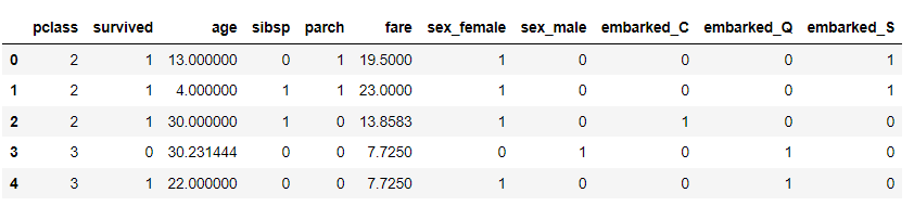
whole_df에 원-핫 인코딩을 적용한 뒤, train과 test로 데이터를 분리할 것이다.
분류 모델링 : 로지스틱 회귀 모델
from sklearn.linear_model import LogisticRegression
from sklearn.metrics import accuracy_score, precision_score, recall_score, f1_score

# 데이터를 학습 데이터, 테스트 데이터셋으로 분리
x_train, y_train = df_train.loc[:, df_train.columns != 'survived'].values, df_train['survived'].values
x_test, y_test = df_test.loc[:, df_test.columns != 'survived'].values, df_test['survived'].values

# 로지스틱 모델 학습
lr = LogisticRegression(random_state = 0)
lr.fit(x_train, y_train)

# 학습한 모델의 테스트 데이터셋에 대한 예측 결과 반환
y_pred = lr.predict(x_test)
y_pred_probability = lr.predict_proba(x_test)[:, 1]
이렇게 로지스틱 모델을 학습하고, 예측 결과를 y_pred_probability에 반환하였다.
그럼, 로지스틱 회귀 모델이 생존자를 얼마나 잘 분류하는지 알아볼 것이다.
일반적으로 분류 모델의 평가 기준은 Confusion Matrix를 활용한다.
분류 모델 평가하기
# 테스트 데이터셋에 대한 정확도, 정밀도, 특이도, f1 평가 지표 출력
print('Accuracy : %.2f' % accuracy_score(y_test, y_pred))
print('Precision : %.3f' % precision_score(y_test, y_pred))
print('Recall : %.3f' % recall_score(y_test, y_pred))
print('F1 : %.3f' % f1_score(y_test, y_pred))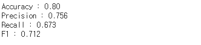
# Confusion Matrix
from sklearn.metrics import confusion_matrix

confmat = confusion_matrix(y_true = y_test, y_pred = y_pred)
print(confmat)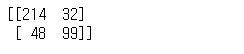
마지막으로 AUC를 출력해본다.
from sklearn.metrics import roc_auc_score, roc_curve

false_positive_rate, true_positive_rate, thresholds = roc_curve(y_test, y_pred_probability)
roc_auc = roc_auc_score(y_test, y_pred_probability)
print('AUC : %.3f' % roc_auc)

# ROC curve 그래프 출력
plt.rcParams['figure.figsize'] = [5, 4]
plt.plot(false_positive_rate, true_positive_rate, label = 'ROC curve (area = %0.3f)' % roc_auc, color = 'red', linewidth = 4.0)
plt.plot([0, 1], [0, 1], 'k--')
plt.xlim([0.0, 1.0])
plt.ylim([0.0, 1.0])
plt.xlabel('False Positive Rate')
plt.ylabel('True Positive Rate')
plt.title('ROC curve of Logistic regression')
plt.legend(loc = 'lower right')
AUC가 약 0.838으로, 생존자를 잘 분류해내는 모델이라고 평가할 수 있다.
그렇다면 분류 모델의 성능을 더욱 끌어올리기 위해 Feature Engineering을 사용해 피처를 가공하여 성능을 더 올려볼 것이다.
모델 개선
# 분류 모델을 위해 전처리하기

df_train = pd.read_csv('data/titanic_train.csv')
df_test = pd.read_csv('data/titanic_test.csv')
df_train = df_train.drop(['ticket', 'body', 'home.dest'], axis = 1)
df_test = df_test.drop(['ticket', 'body', 'home.dest'], axis = 1)

# age의 결측값을 평균값으로 대체
replace_mean = df_train[df_train['age'] > 0]['age'].mean()
df_train['age'] = df_train['age'].fillna(replace_mean)
df_test['age'] = df_test['age'].fillna(replace_mean)

#embark의 결측값을 최빈값으로 대체
embarked_mode = df_train['embarked'].value_counts().index[0]
df_train['embarked'] = df_train['embarked'].fillna(embarked_mode)
df_test['embarked'] = df_test['embarked'].fillna(embarked_mode)

# 원-핫 인코딩을 위한 통합 데이터 프레임 생성
whole_df = df_train.append(df_test)
train_idx_num = len(df_train)
위에서 했던 것과 마찬가지로, age, embark의 결측값을 채운 뒤, 원-핫 인코딩을 진행했다.
이번에는 cabin, name 피처를 가공하여 분석에 포함시킬 것이다.
# cabin 피처 활용

print(whole_df['cabin'].value_counts()[:10])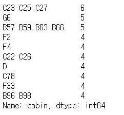
cabin 피처는 선실의 정보를 나타내는 데이터로, 선실을 대표하는 알파벳이 반드시 첫 글자에 등장한다는 패턴을 가지고 있다.
cabin 피처의 결측치는 알파벳이 없다는 의미의 'X'로 대체한다. 그리고 데이터 수가 적은 'G'와 'T' 역시 'X'로 대체한다.
cabin 피처의 첫 번째 알파벳을 추출하기 위해 함수를 실행한다.
# 결측 데이터의 경우 'X'로 대체
whole_df['cabin'] = whole_df['cabin'].fillna('X')

# cabin 피처의 첫 번째 알파벳을 추출
whole_df['cabin'] = whole_df['cabin'].apply(lambda x : x[0])

# 추출한 알파벳 중, G와 T는 수가 너무 작기 때문에 'X'로 대체
whole_df['cabin'] = whole_df['cabin'].replace({'G':'X', 'T':'X'})

ax = sns.countplot(x = 'cabin', hue = 'survived', data = whole_df)
plt.show()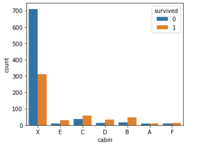
cabin 피처의 생존자 / 비생존자 그룹 간 분포는 위와 같다. 이를 살펴본 결과, 두 그룹 간의 유의미한 차이가 있는 것으로 보인다.
다음으로 name 피처를 살펴보자. name 피처를 어떻게 사용할 수 있는지 난감하지만 살펴보면 호칭이 중간에 들어간 것을 보아 사회적 계급이 존재한다고 볼 수 있다. 그러므로 name 피처는 매우 중요한 데이터라고 볼 수 있다.
# name 피처 활용
# 이름에서 호칭 추출

name_grade = whole_df['name'].apply(lambda x : x.split(', ', 1)[1].split('.')[0])
name_grade = name_grade.unique().tolist()
print(name_grade)
위에서 추출한 호칭을 여섯 가지의 사회적 지위로 정의할 수 있다. 함수를 통해 name 피처를 범주형 데이터로 변환하는 작업을 수행한다.
#호칭에 따라 사회적 지위 정의

grade_dict = {'A' : ['Rev', 'Col', 'Majjor', 'Dr', 'Capt', 'Sir'], # 명예직
             'B' : ['Ms', 'Mme', 'Mrs', 'Dona'], # 여성
             'C' : ['Jonkheer', 'the Countess'], # 귀족이나 작위
             'D' : ['Mr', 'Don'], # 남성
             'E' : ['Master'], # 젊은 남성
             'F' : ['Miss', 'Mlle', 'Lady']} # 젊은 여성

# 정의한 호칭의 기준에 따라 name 피처를 다시 정의
def give_grade(x):
    grade = x.split(', ', 1)[1].split('.')[0]
    for key, value in grade_dict.items():
        for title in value:
            if grade == title:
                return key
    return 'G'

whole_df['name'] = whole_df['name'].apply(lambda x: give_grade(x))
print(whole_df['name'].value_counts())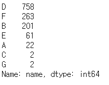
위의 결과로 보아 남성이 가장 많았고, 그 뒤로 젊은 여성과 여성이 많았다.
이제 모델을 학습하기 위해 원-핫 인코딩을 진행한다.
# 원-핫 인코딩

whole_df_encoded = pd.get_dummies(whole_df)
df_train = whole_df_encoded[:train_idx_num]
df_test = whole_df_encoded[train_idx_num:]
df_train.head()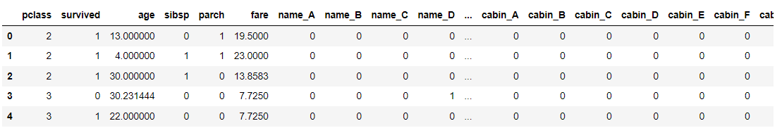
Feature Engineering이 완료된 데이터셋 학습
위에서 진행한 것과 마찬가지로 데이터셋을 분리하고 로지스틱 회귀 모델을 학습해 평가 지표를 나타낸다.
x_train, y_train = df_train.loc[:, df_train.columns != 'survived'].values, df_train['survived'].values
x_test, y_test = df_test.loc[:, df_test.columns != 'survived'].values, df_test['survived'].values

lr = LogisticRegression(random_state = 0)
lr.fit(x_train, y_train)

y_pred = lr.predict(x_test)
y_pred_probability = lr.predict_proba(x_test)[:, 1]

# 테스트 데이터셋에 대한 정확도, 정밀도, 특이도, f1 평가 지표 출력
print('Accuracy : %.2f' % accuracy_score(y_test, y_pred))
print('Precision : %.3f' % precision_score(y_test, y_pred))
print('Recall : %.3f' % recall_score(y_test, y_pred))
print('F1 : %.3f' % f1_score(y_test, y_pred))

false_positive_rate, true_positive_rate, thresholds = roc_curve(y_test, y_pred_probability)
roc_auc = roc_auc_score(y_test, y_pred_probability)
print('AUC : %.3f' % roc_auc)

# ROC curve 그래프 출력
plt.rcParams['figure.figsize'] = [5, 4]
plt.plot(false_positive_rate, true_positive_rate, label = 'ROC curve (area = %0.3f)' % roc_auc, color = 'red', linewidth = 4.0)
plt.plot([0, 1], [0, 1], 'k--')
plt.xlim([0.0, 1.0])
plt.ylim([0.0, 1.0])
plt.xlabel('False Positive Rate')
plt.ylabel('True Positive Rate')
plt.title('ROC curve of Logistic regression')
plt.legend(loc = 'lower right')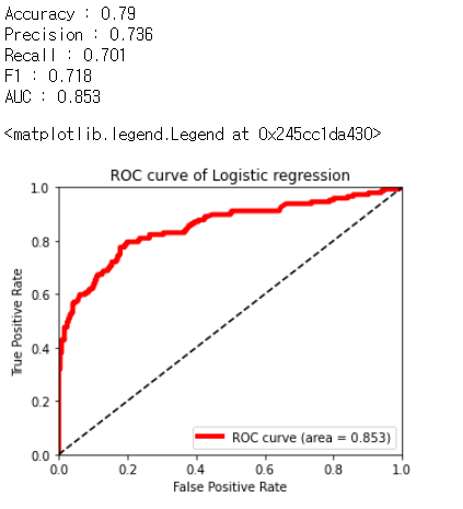
AUC가 0.853으로 이전에 만든 모델인 0.838보다 높게 나왔다. 이를 통해 모델의 성능이 많이 향상되었다는 것을 알 수 있다.
다음으로 피처 영향력을 살펴볼 것이다.
cols = df_train.columns.tolist()
cols.remove('survived')
y_pos = np.arange(len(cols))

plt.rcParams['figure.figsize'] = [5, 4]
fig, ax = plt.subplots()
ax.barh(y_pos, lr.coef_[0], align = 'center', color = 'green', ecolor = 'black')
ax.set_yticks(y_pos)
ax.set_yticklabels(cols)
ax.invert_yaxis()
ax.set_xlabel('Coef')
ax.set_title("Each Feature's Coef")

plt.show()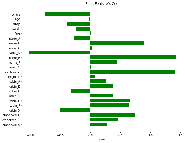
피처 영향력을 보면 name, cabin 피처의 영향력이 가장 크다는 것을 알 수 있다.
모델 검증하기
마지막으로 완성된 분류 모델을 검증하는 단계이다. 이를 위해 모델의 과적합 여부를 검증해야 한다. 과적합 검증 방법은 두 가지로 나뉘는데, 첫 번째는 K-Fold 교차 검증, 두 번째로는 학습 곡선을 살펴보는 것이다.
from sklearn.model_selection import KFold

k = 5
cv = KFold(k, shuffle = True, random_state = 0)
auc_history = []

for i, (train_data_row, test_data_row) in enumerate(cv.split(whole_df_encoded)):

    # 5개로 분할된 fold 중 4개를 학습 데이터셋, 1개를 테스트 데이터셋으로 지정. 매 반복시마다 테스트 데이터셋은 변경
    df_train = whole_df_encoded.iloc[train_data_row]
    df_Test = whole_df_encoded.iloc[test_data_row]

    splited_x_train, splited_y_train = df_train.loc[:, df_train.columns != 'survived'].values, df_train['survived'].values
    splited_x_test, splited_y_test = df_test.loc[:, df_test.columns != 'survived'].values, df_test['survived'].values

    lr = LogisticRegression(random_state = 0)
    lr.fit(splited_x_train, splited_y_train)
    y_pred = lr.predict(splited_x_test)
    y_pred_probability = lr.predict_proba(splited_x_test)[:, 1]

    false_positive_rate, true_positive_rate, thresholds = roc_curve(splited_y_test, y_pred_probability)
    roc_auc = roc_auc_score(splited_y_test, y_pred_probability)
    auc_history.append(roc_auc)

plt.xlabel('Each K-fold')
plt.ylabel('AUC of splited test data')
plt.plot(range(1, k+1), auc_history)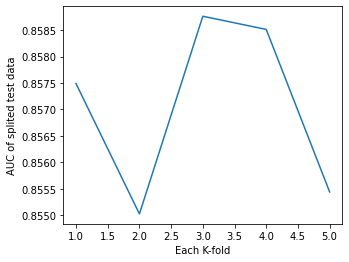
교차 검증은 K번째 실행마다 AUC를 리스트에 저장하고, 이를 그래프로 나타낸 것이다. 그래프를 보면 AUC가 큰 폭으로 변화하고 있는 것을 볼 수 있다. 따라서 이 모델은 다소 불안정한 모델이라고 할 수 있다. 또는 데이터셋의 개수가 적기 때문에 발생할 수 있는 현상이라고 볼 수도 있다. 모든 실행에서 Test AUC가 0.85 이상의 수치를 기록했기 때문에 이 분류 모델은 '과적합이 발생했지만 대체로 높은 정확도를 가지는 모델'이라고 할 수 있다.
두 번째로 학습 곡선을 살펴본다.
학습 곡선을 관찰함으로써 더 쉽게 과적합이 발생하는 상황을 관찰할 수 있다.
import scikitplot as skplt

skplt.estimators.plot_learning_curve(lr, x_train, y_train)
plt.show()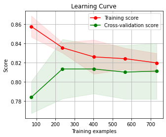
위의 그래프는 학습 데이터 샘플의 개수가 증가함에 따라 학습과 테스트 두 점수가 어떻게 변화하는지를 관찰한 그래프이다. 이를 통해 데이터가 300개 이상인 경우에는 과적합의 위험이 낮아진다는 것을 알 수 있다.
이렇게 타이타닉 데이터셋을 가지고 EDA, 분류 모델을 만들어보았다.
앞으로 기초적인 데이터를 가지고 분석을 해보는 연습을 많이 해야겠다고 생각했다.
- 출처 : 이것이 데이터 분석이다 with 파이썬
'Kaggle' 카테고리의 다른 글
| [샌프란시스코 범죄 분류] - 1 (0) | 2021.10.05 |
|---|---|
| [진짜 재난 뉴스 판별기] - 2 (0) | 2021.10.04 |
| [진짜 재난 뉴스 판별기] - 1 (0) | 2021.10.01 |
| [자전거 수요 예측] - 1 (0) | 2021.09.10 |
| [타이타닉 생존자 분류] - 1 (0) | 2021.09.08 |
